1. In what ways does your media product use, develop or challenge forms and conventions of real media products?
My music video conforms to the style of indie pop rock. I have used similar conventions to the videos that I analysed, the first of these is the use of fast editing to disillusion the audience and force them to repeat the video to take in various shots. The track therefore has the repeatability factor. This theory was highlighted by Steve Archer. My video also conforms to the theory highlighted by Pete Fraser, by using a person of the opposite sex; his theory of voyeurism becomes apparent. Obviously as I am producing a video within a college I cannot use explicit voyeurism as this would be inappropriate.
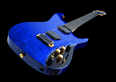
My music video uses camera angles in a way which is similar to other videos of the same genre, many music videos use large amounts of close ups and fill the frame; my music video does this in a variety of ways; firstly I use many close ups on the lead vocalist and the main instruments, I also used multiple images to ensure the entire screen was full. However, parts of my video do challenge this convention, I use a long shot on a man cut in half, a nd this is however done to gain a perspective on an unusual situation. The close ups at the beginning of the video create a sense of mystery, as the audience only see the character’s face. When the long shot appears the audience are aware of the obscure situation.
My music video includes some narrative, this relates to the title of the song and the lyrics. The title ‘green eyed monster’ meaning jealousy, allowed me to play with a stereotypical love story falling apart, and the introduction includes an  argument which is segmented by instrumentals. This segmented narrative is continued in an unusual fashion where the woman stands dancing and almost directly teasing the man, whilst looking directly at the camera. The video also plays on a double meaning of ‘green eyed monster’.
  The dismembered man lying on a blank black mise-en-scene represents a victim of a literal ‘monster’. This follows the convention that the lyrics directly relate to the narrative and contents of the video this conforms to the theory written by Steve Archer.
My video conforms to one other convention of a music video, that music videos create a ‘star image’. This ‘star image’ theory was created by Dyer. I feel that by using only close ups on the faces as well as the instruments a star image is created. Where the lead singer does appear, he is the main focus of the camera and takes centre stage, by increasing the amount of camera time I am able to promote a better ‘star image’.
2. How effective is the combination of your main product and ancillary texts?
There is continuity throughout all of my productions, I have made sure that the colour  scheme stays the same and the branding of the
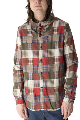
  band is constant. Both my digipack and website include tour dates, and similar images, there are many edited images which create a sense of star image through all 3 texts. The costume for photography through all three texts is also similar to suit the indie pop rock genre, many similar products in the same genre use a shirt and jeans combination with some band members in a more casual costume such as a hooded jumper. The costume varies through each text but maintains a similar style, I found this to be important to help create the bands star image and keep a consistency.
Within the digipack and the website I include biographies of the members of the band, there is information on each member and how the band formed, and this should appeal to fans of the band as they may wish to know more information and be elitist in their knowledge of the band. The combination of the products work well as I managed to advertise the website on the back of the digipack and throughout it, I also managed to advertise the video on both the website and the digipack giving ‘behind the scenes’ information. This is a promotional technique which is used by bands in order to create a star image.
There are many similarities between my texts, the colour scheme being the key, the colour scheme which originated from the creation on the 1984 logo continues throughout all three productions, the website adopts these colours in the rainbow lines embedded within the banner and further down the website page the logo is repeated many times within different adverts. I incorporated it into the image below to maintain the bands identity. Another similarity between my texts is the use of critics’ opinions, on the right hand side of some of the pages in the Digipack there is a use of some magazine article quote which emphasise the band’s success. The critic’s reports are also reflected in the website with the flashing graphic changing between different comments from established magazine and TV media giants. These similar features help create a rounded and complete image of the band.
3. What have you learned from your audience feedback?
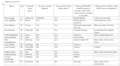
My video received praise from my audience feedback for the editing; the quick snappy shots were appreciated by the audience with some asking to see the video again. This follows the conventional theory by Steve Archer where quick edits are used to increase the ‘repeatability factor’ on music channels. The audience also recognised the precision audio video synchronizing to be a positive which enhanced the final production; the lip syncing matched up well and the variety of shots broke up some of the singing scenes.
The variety of editing techniques I used also had a positive effect on the audience; the introduction which uses the split screen effect to help initiate each scene within the short instrumental at the beginning added an unusual and different touch to the production. This effect also went well hand in hand with the colourful mise-en-scene used throughout. I aimed to maintain a similar colour scheme within the video as I used in my digipack and website. The blue, green, red and yellow scheme was used for two reasons; the first being to continue the colour scheme of the 1984 logo I had created and the second was to differentiate the scenes for the audience. I have found both of these to be achieved as the audience recognised these aspects.
The ‘mood lighting’ on each shot also created an ambience around each instrument and character within the video. The scene which includes the woman posing in front of the 1984 graphic also received praise, the audience liked the way I had created a static effect, and portrayed a post 1970s theme in conjunction with the continuity of a black background, the woman also looked slightly angelic with the whitened image creating a radiant glow. It was argued by some that I should have used more of this type of footage, but I found I did not want this to overpower the entire video and just wanted to include it at various points to support and uphold the narrative from the beginning.
One other specific aspect pointed out by the audience was the use of the drummer standing up and leaving at the end, they mentioned that it rounded the video off effectively; it was the perfect shot to conclude the production. Some general points from the audience included that; firstly the speed of the song and editing matched similar genres of videos and secondly, the music matched the cuts well, apart from one of two instrumental synchronisations.
My website also received positive feedback. I found that band promotion was key to this project therefore I was pleased when two people described the website as ‘professional’. There were many positives from the audience including the continued colour scheme from my other media. The way I had adapted the colour scheme within the website was also appreciated by the audience, the contrasting black, white and grey animation to head the screen worked well to allow other aspects to stand out above. The continuous use of the 1984 logo allowed for an increased branding of the band. The audience had also recognised that I had used advertisements to frame the page and fit the colour scheme. Other characteristics noticed by the audience which they believed bettered the website was the use of lots of hyperlinks and good mixture of text and images, they thought the interactivity was impressive. There were a few criticisms, including the colours on the tour promotion part being a bit unusual; however, we found that this was because of the nature of the output. One final criticism was of the links  embedded within the banner, people pointed out that they may have been slightly too askew and they should be angled more horizontally, personally I found it made the links stand out and drew attention to them as they weren’t placed in conventional position.
My final text, the digipack also received positive feedback, the key parts pointed out by the audience as good included the use of magazine quotes as puffs to promote the band on every right hand page. The audience liked the neat layout and the use of images to jazz it up; however, one person did mention that a more exciting font could have been used. If I was to reproduce the product I may have done made it with a more exciting font, but on the other hand I wanted to keep the text simple to allow the images on the right hand page to be the main focus. The audience also responded well to the photography of each band member, the recognised the connotations of fun for the images fitting well with the genre. Also, as in the website, there is a continuous use of the band logo to maintain the promotion of the band. The audience liked the simplicity of the back page, making the website the key feature and the simple silhouetted image at the base of the page. One peer did argue that the spine could have been more vibrant with a use of another image or different text. When looking at the spine on the digipack I believe that it is recognisable amongst other CDs due to the consistent branding of the band down the side, but does not stand out as there is minimal vibrancy.
4.How did you use new media technologies in the construction and research, planning and evaluation stages?
To research the video I managed to utilise modern resources such as YouTube to obtain  videos to analyse, the variety of videos available from this modern technology helped me choose tracks specifically related to my genre. The research for my Digipack allowed me to analyse physical materials and material found through Google,
 I researched types of digipacks which reflected a similar genre to what I would produce, I found that this gave me a good insight into what I could produce. For the research into websites I used my knowledge of bands to refine my searches, this allowed me to research music videos of a similar genre such as The All American Rejects.
To plan my digipack I drew out numerous drafts and developed the ones I liked further. I produced two main drafts for the digipack and then reproduced in Fireworks CS4, this gave me a detailed insight into what my final product may look like, this also allowed me to adapt my other media forms to create continuity in colour scheme and images. To plan my website I found that I could work on my knowledge of Dreamweaver CS4 and work on drafting paper and computerised versions, this meant when I came to develop my website further I could adapt it easily by just enhancing certain graphics.
I have also used various techniques to produce the final products, for the video I used techniques such as green screening, which helped produce the effect below.  this meant learning new skills. When green screening I had to learn how to adapt images within Adobe Premier Pro. Adobe Premier Pro, is an advanced piece of editing software, I looked to maximize my knowledge before beginning production which meant I could use various tools in construction to improve the quality of the video. One example of me using the tools to enhance the video is the use of lighting. I used a tool within the program to create various coloured lighting,
 this meant filming was much simpler as there was less to organise. It also allowed me to merge my music and video so they were correctly synchronised, the fine synchronisation was key as my track included alot of instrumentals.
To produce my website I used Dreamweaver CS4, this meant developing my skills prior to production. I used this program to develop the main base for the website but used it in conjunction with Flash CS4 to produce various aspects, for example the banner and the advertisements. The Images on the website and the Digipack were all edited within Fireworks CS4, this advanced piece of editing software meant the production could be of a good quality. My images were taken with a Canon 350i camera, this meant they were well detailed images and when editing I could focus in on certain parts of images without pixilation.


