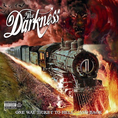
This is typical of traditional album covers, it uses detailed album artwork which when vinyl records were used the larger covers would allow for this. The Darkness use the artwork as the focus of the cover to attract, the title of the album is tucked away at the bottom of the screen.
The Darkness logo is adapted to suit the semantic field surrounding the album, the devil tail serif adds to the meaning through the use of graphology. The vibrant colours and individuality of the cover will help customers in record stores spot the album. The cover, unusually has no band relation - by this I mean that there are no images of the band itself.

This album cover is very simple in its design, also it a huge contrast to the first album, the images of the band is used with a plane black and white colour scheme. The black and white image is used as the album name, 'inside in, inside out' is accentuated with the use of red. The band name, 'the kooks' is embedded in the album name in the large blank white space allowing browsers to see it clearly.
No comments:
Post a Comment