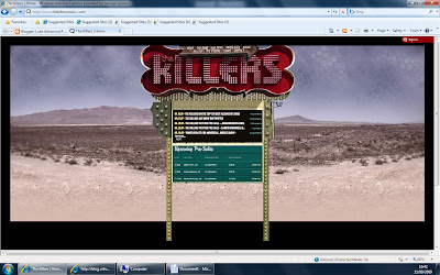
The killers’ website is a simple design using the bands logo as the main focus, the entire layout of the page is similar to a motel road sign on route 66, the sign with the killers’ logo at the peak uses an L.E.D style to spell out the letters.
The additional information on the sign includes tour dates which are under the title, ‘upcoming pre-sales’ the bands layout may be reflective of their current American tour. Each of the menu options at the top are unusual and do not follow the conventional menu options, they use ‘the road’ instead of ‘tour dates’, this helps with the American related semantic field. Other menu options which follow this feature are ‘sweet talk’ and ‘the victims’ both referring to their online chat and fan club.
The background image follows the ‘route 66’ style that they are trying to portray, they use various terrain and which is plain and dull, the mountains blend into the background as closer to the camera are closed off fields, the sand covers most of the image and the plain colours help the main image stand out (the sign).

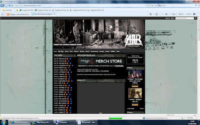
This website, design, for the 'All-american rejects' is alot more conventional, it uses a normal banner which includes an image of the band and their name, the image of them is of the band in session recording a single - this creates connotations of creativity. The website includes all of the usual information that you expect on a bands website but there are some differences, there is a feature called 'rejects TV' which is a youtube style feature, there are various videos of the band on tour, this may be a good idea for my website as there are videos about, the only issue with this would be copyright.
Down the left hand side of the screen it includes all of their tour dates, normal menu tabs are also used, for example; news, tours, music and photos.
Additional news is posted down the centre of the page with the additional features to the left, the page scrolls down for about 4 screens due to the amount on it. The mainly interactive website is plain with a simple image in the background, the sentence 'the world comes down', the title of one of their albums and the bands tagline, this is also repeated in the banner.
No comments:
Post a Comment